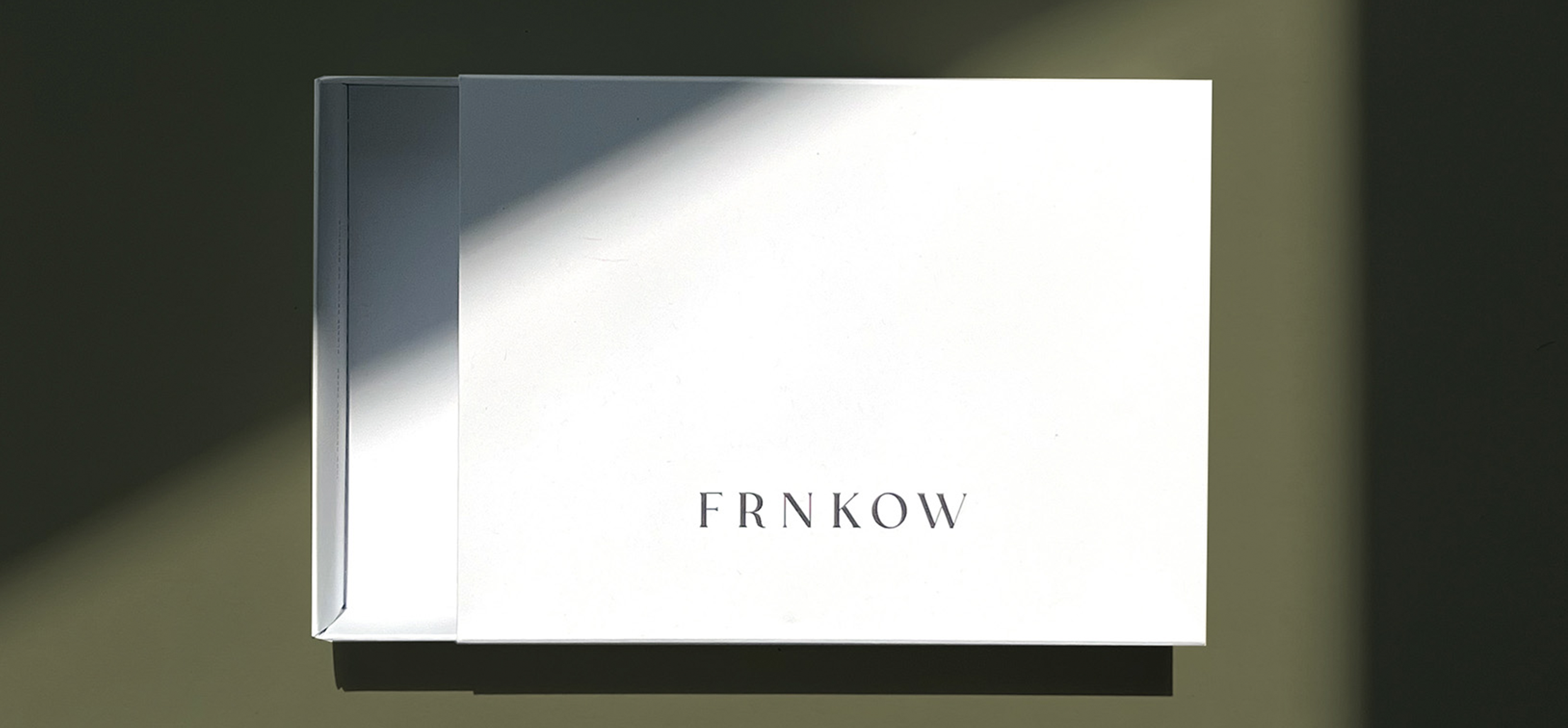
What looks super simple is not always easy to do. The minimalist appearance of a packaging is a result of a special sensitivity and close attention during the development phase. What matters? The fine details.
A packaging is a canvas that, when strategically designed, can send important messages for brands. The quality of the paper, the feel of the surface, the brilliance of the colours, the finishing touches – all of this fits together like a mosaic, contributes to the impression of the overall appearance of the packaging and ideally conveys an emotion that is in line with a brand’s values. Fashion label FRNKOW has acknowledged this sensitivity for detail and passed on its vision to us.
What visual character has the brand wished to embody? “What is important to me is a beautiful, natural feel and a strong, high-quality paper with a high degree of whiteness. As sustainable as possible,” explained Frank Lin. He founded the fashion brand in 2020 with his sister Nadja. The southern German label offers minimalist men’s fashion with a penchant for sensuality. The designs of the products combine classic and tradition with soft silhouettes. In this sense, the packaging design should also be embedded in the branding.
“As a design brand, we create fashion and lifestyle objects that inspire mindful living – inside and outside of your own home.” After a conversation with the siblings, it was clear: the brand does not see sustainability as a trend, but as state of the art, something that should be the norm rather than a nice addition. The FRNKOW garments are made in Europe and Frank and Nadja are not committed to the ephemerality of a season, instead they aim to produce timeless pieces. Simple and beautiful, the care and attention that goes into the design and manufacture of the products should also be communicated through an unboxing experience that appeals to the senses. The art is: “luxury” through minimalism. Communicate high quality and create packaging that fits into any era thanks to its classic approach.
Specifically, the folding box was to be designed for the products from the underwear collection. The target group appreciates quality and is willing to invest a little more for it. The design result can not only be seen, but you have to feel it: The double-walled treatment of the box ensures stability and strength. In addition, the packaging impresses with recycled fine paper with a rough and matt surface structure. The colour can be described as a stone gray, yet doesn’t look cold-hearted. Instead it feels light and cloudy. A logo embossing in black complements the box harmoniously and still provides a pleasant contrast.
The FRNKOW logo, which wears soft serifs, is integrated in line with the overall design, while the typography used for the running text dispenses with ornamentation and flourishes. Overall, the package design is direct, uncomplicated and characterised by timeless elegance – in the spirit of the two founders and art directors. Texts are discreetly placed and cleverly distributed throughout the packaging. The inside of the folding box bears the note “100% recycled paper – please reuse or recycle”. The note on the back of the packaging gives an insight into the brand philosophy. The simple greeting card that is placed inside is made of the same paper and completes the coherent look. The minimalist approach also benefits nature: little use of materials and colors, as well as a sustainable, long-lasting design concept that calls for reuse. In the future, labels will be developed for the different boxer short sizes so that the production of an additional print or additional packaging variant can be avoided.
FRNKOW likes the result and they get to the point again without unnecessary embellishments: “The packaging turned out super nice and just as we imagined it.” Instead of a snap-on lid, the folding box has a slipcase that guarantees beautiful and sensual unpacking. The suprtrue classic fine paper impresses with its naturally rough feel, the 100% recycled fibers and its high degree of whiteness. The individual packaging development was implemented by suprtrue a brand by Packaging Circus GmbH. All packaging elements were produced in Germany.


